Rebrand | branding, typography
Proposal, personal project
Case Study: Third Avenue Charitable Organization
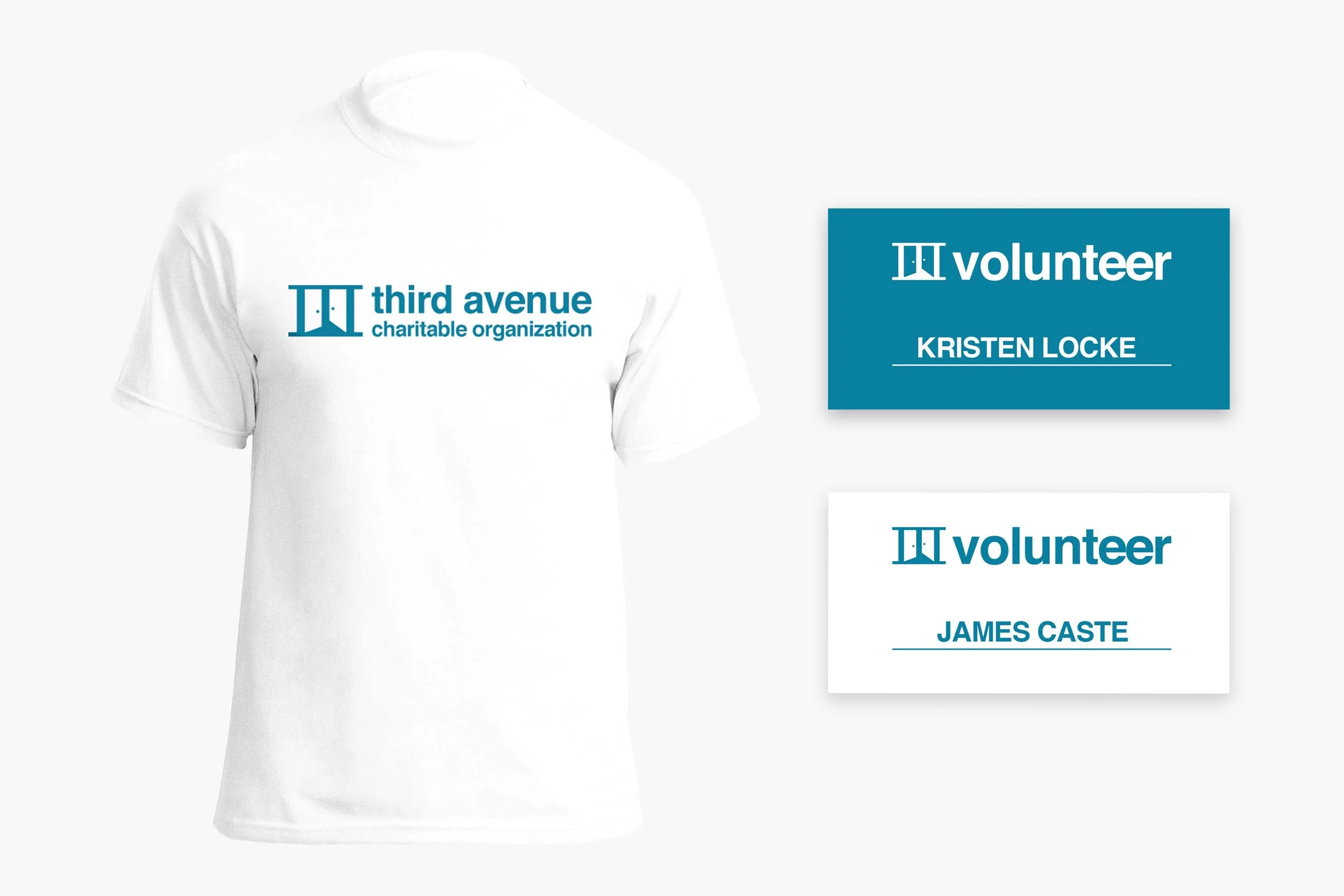
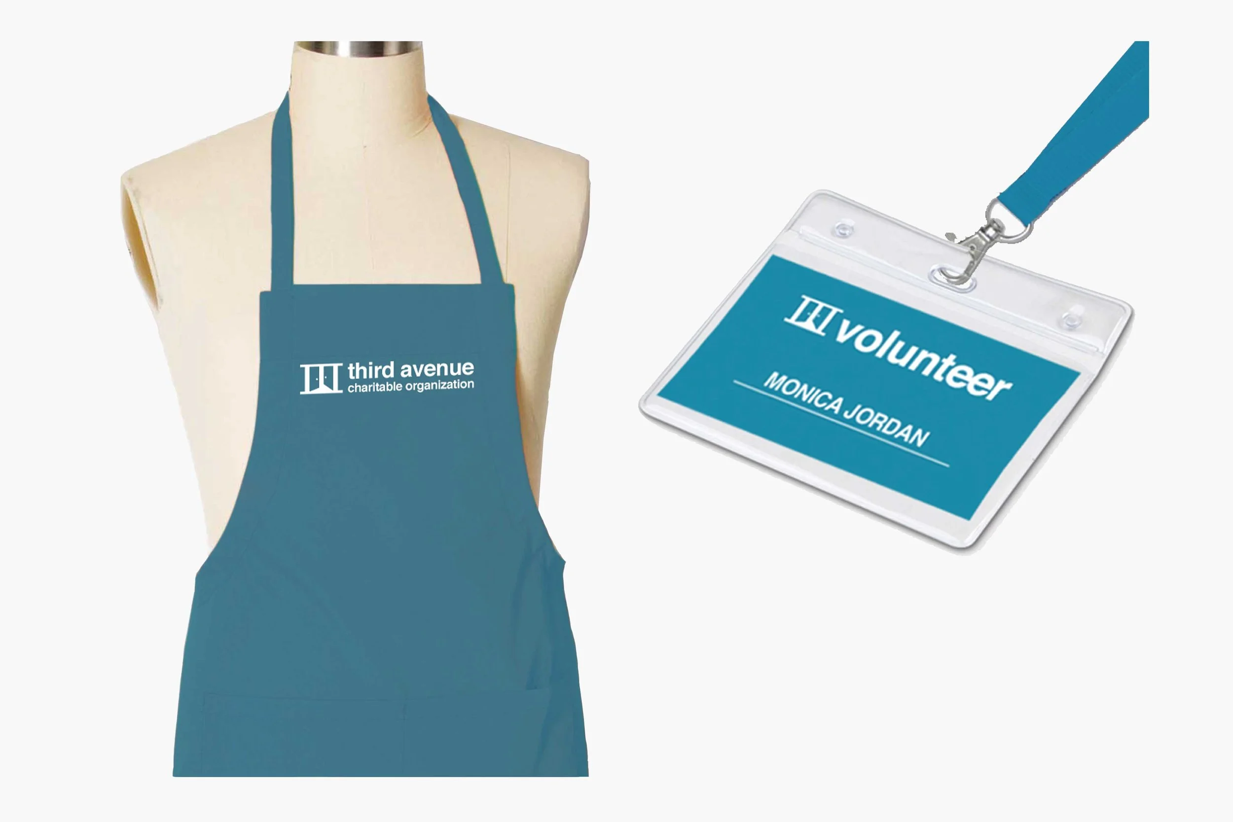
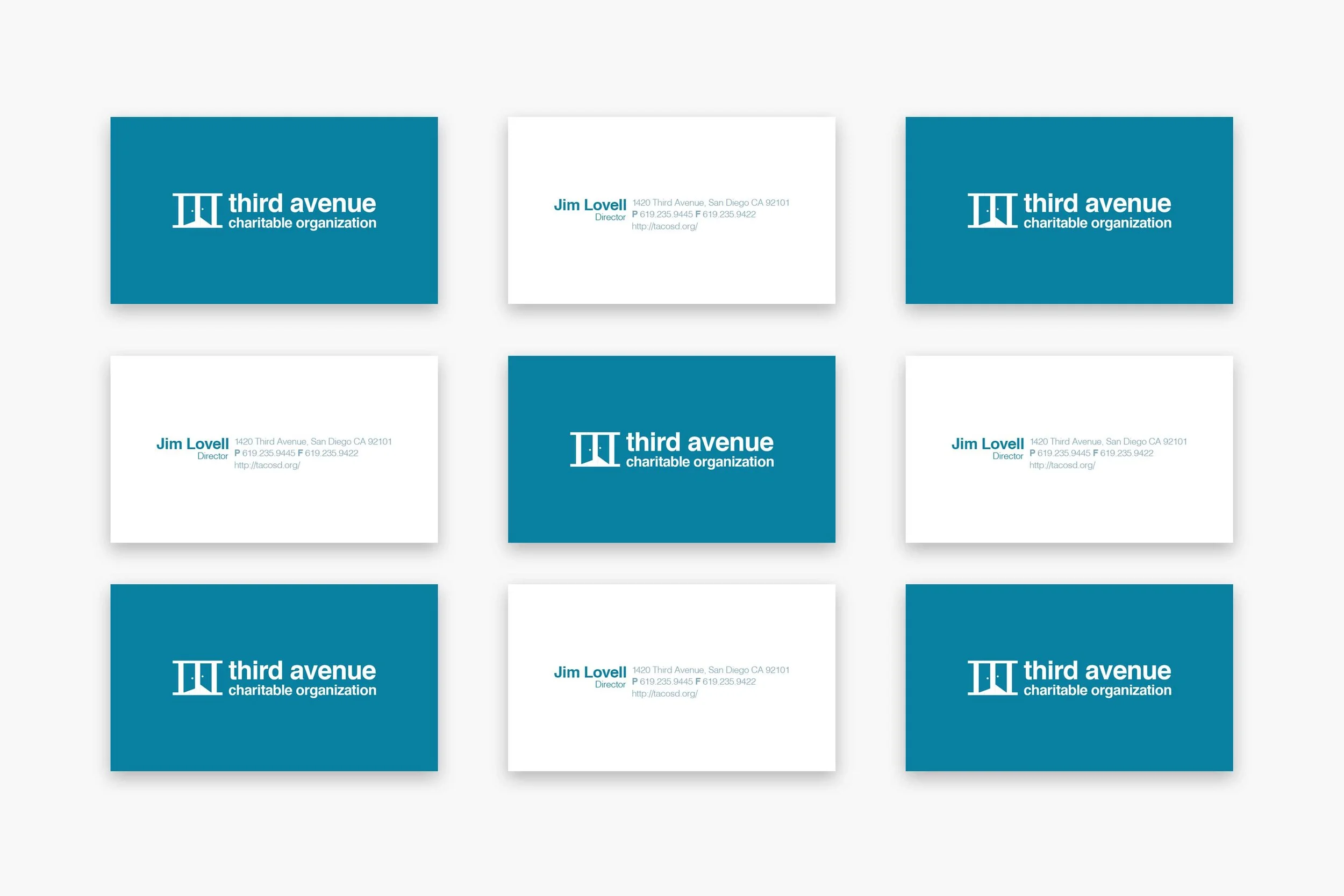
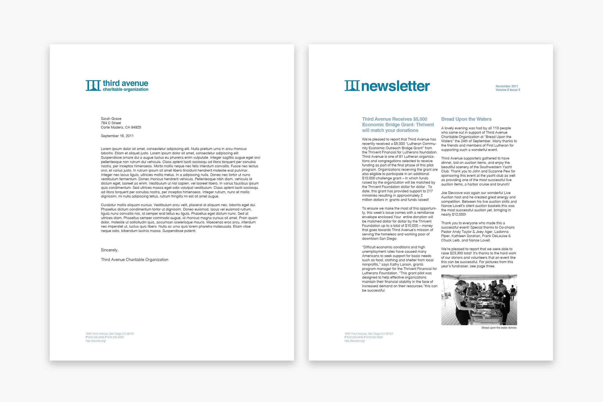
The goal of this rebrand was to redefine the identity of an organization commonly known as "TACO," which is often misunderstood by its audience. They define themselves as “a community drawn together to support the dignity, health and well-being of people among us experiencing homelessness and poverty.” The organization needed a brand that clearly reflects its mission.
The new logo and brand identity focus on community and support, symbolized by open doors within the Roman numeral III. This design represents inclusivity, assistance, and a welcoming space for those in need. Through thoughtful branding, the rebrand strengthens the organization’s connection with the people it serves.